Cleaned up styling to improve theme compatibility
With the new version release, our team implemented a few functional and aesthetic improvements for our templates. Each WordPress theme has a distinct stylesheet, which can cause conflicts with the custom styling we include in our templates. The last thing we want is for clients to experience bugs or for our styling to break. To combat problems like these, we did a styling clean-up and tested out templates with different WP themes.
Through the addition of custom CSS and improved styling in this new release, we have improved the spacing within the page to fit the content better and removed default widget typography settings so that the templates would inherit theme typography settings
Anyone who uses the current release of our templates can better understand what each rule does through the addition of inline documentation/comments.
Better styling for Lifter LMS notifications
This update features some aesthetic improvements to the LifterLMS notifications. By default, LifterLMS gives students a pat on the back as they complete course content through a notification pop-up. With our templates, the notification pop-ups are better styled, featuring colors that match the chosen course template.
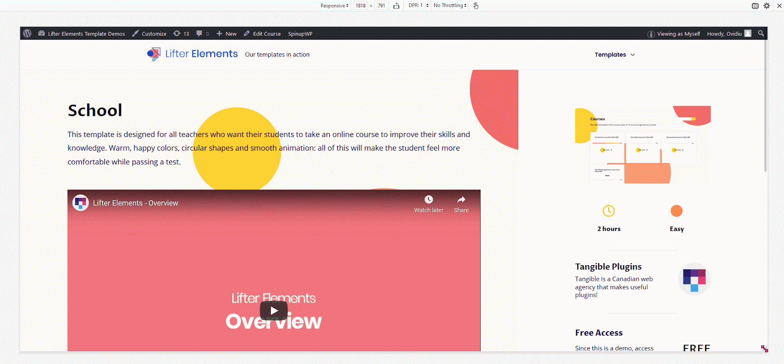
Bubble Theme 
Medical Theme 
Corporate Theme
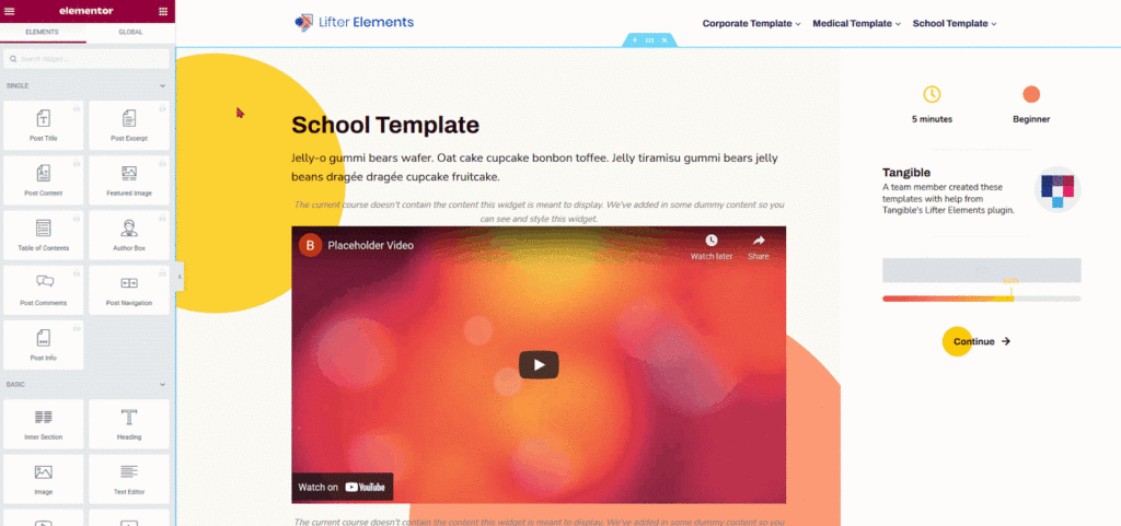
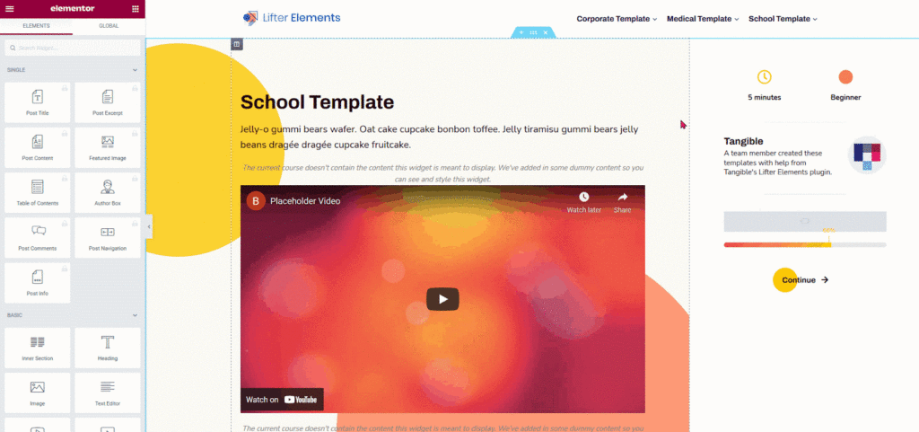
Moved widget specific styles to widget CSS panel
Our previous templates had all the widget-specific styles compiled in the Custom CSS panel, making it harder for developers to identify widget-specific rules and precluding the use of Elementor’s selector keyword. With the new version release, all widget styles have been moved to their own custom CSS panels for better readability and accessibility. Everything from course progress to icon boxes to buttons; all widgets with custom styling have their styles located in the widget-specific custom CSS panel. Below we have provided a couple of examples showing you where to find the styling for some of the template widgets.
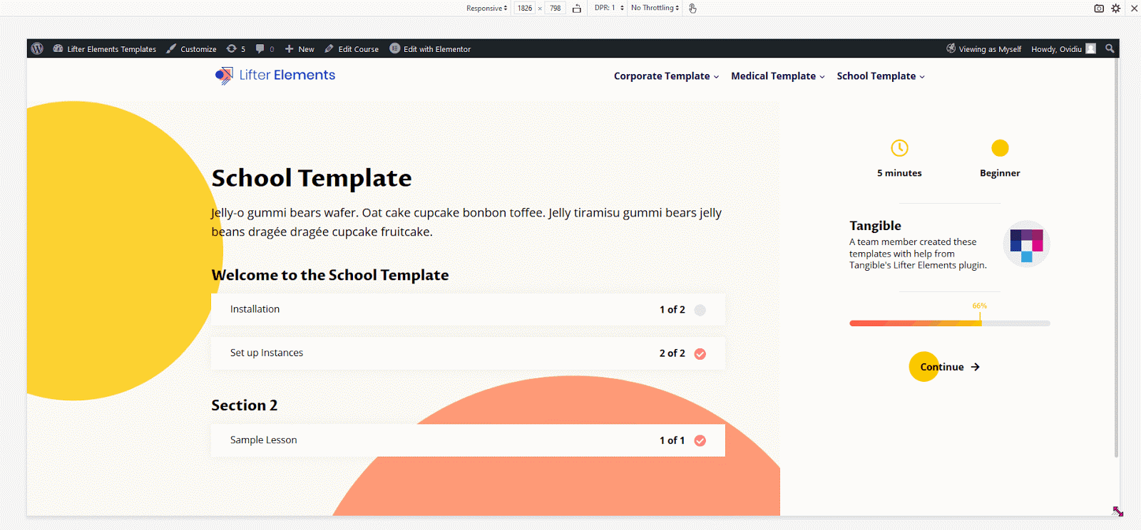
Improved container width to be more consistent
Since most of our students run courses on their mobile devices and tablets, focusing on responsive design is crucial. Therefore, one of the minor changes that significantly impacted our responsive design was adding a fixed width to our course progression sidebar. This change allowed better scaling for different size screens, smoother navigation, and better aesthetics across all devices.
Here is a visual of the old template’s responsive behavior compared to the new one. Note the consistent max-width of the content and sidebar containers in the new design compared to the old one.